RESONANZ  Brand Identity, Typography, Naming


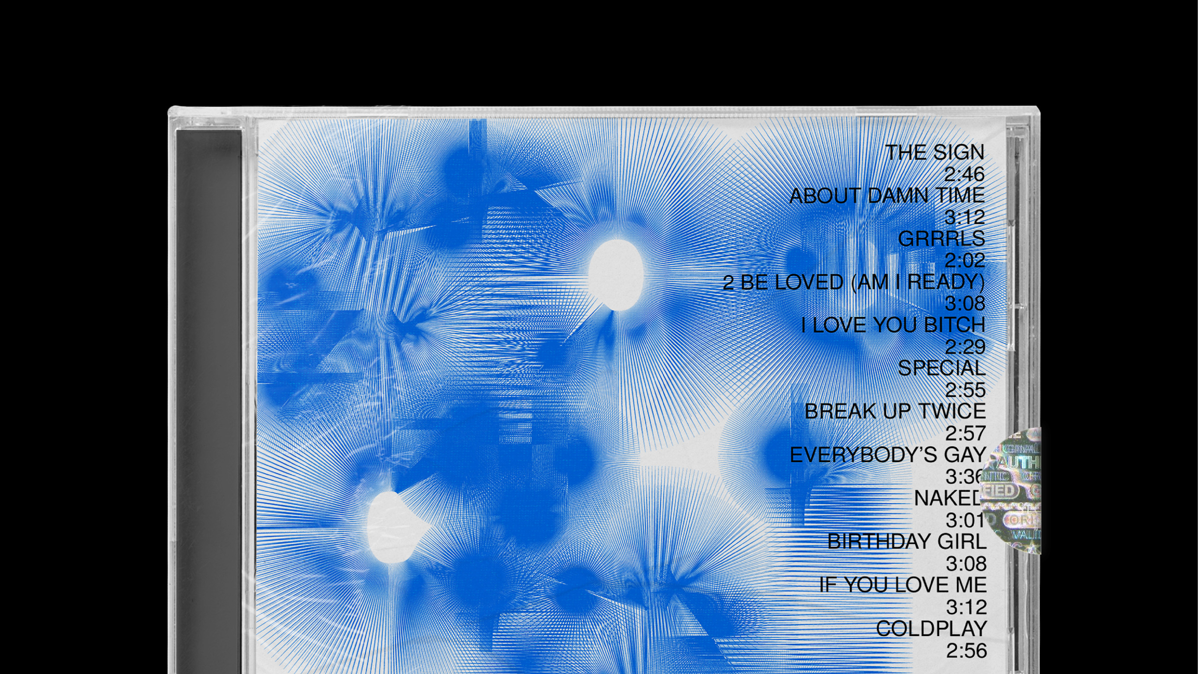
This project was to design a brand identity for an experimental music festival called ‘RESONANZ’. This festival is held at the CERN, the European Organization for Nuclear Research. The concept was to depict the movements of the particles. 


FIORUCCI  Campaign Design, Typography, Art Direction (WIP)


This campaign captures the essence of a 1960s home party, stylized with a twist of enigmatic allure and Fiorucci's iconic playful irreverence. It's a reinterpretation of the social gatherings of the era, known for their vibrant fashion and groundbreaking music, yet presented with an unexpected mood: a party where guests appear disenchanted, encapsulating a moment frozen in time where the excitement has faded, but the style remains timeless.


MIRAGE MARKET  Editorial, AI, Brand Identity, Naming


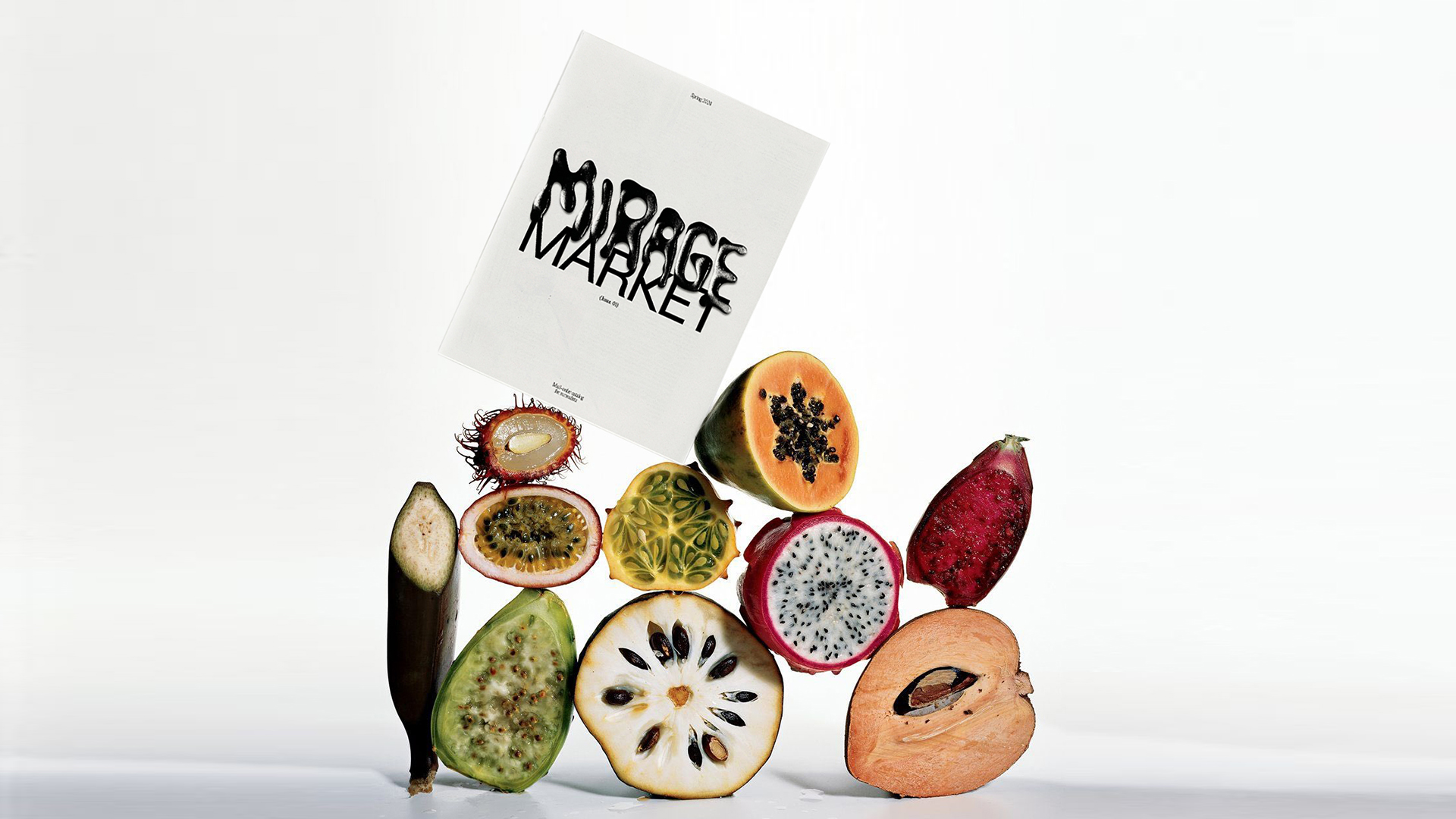
Mirage Market is a mail-order catalog that sells fruit grown by surrealists. By integrating AI’s unique capabilities, people can see fruits that embody a blend of surrealism and digital uncanniness. These AI-generated fruits will feature textures and forms that combine organic elements with digital alterations, showcasing the intersection of natural beauty and artificial creativity. All of the images were generated by Midjourney.


MoMA FALL CAMPAIGN  Campaign Design


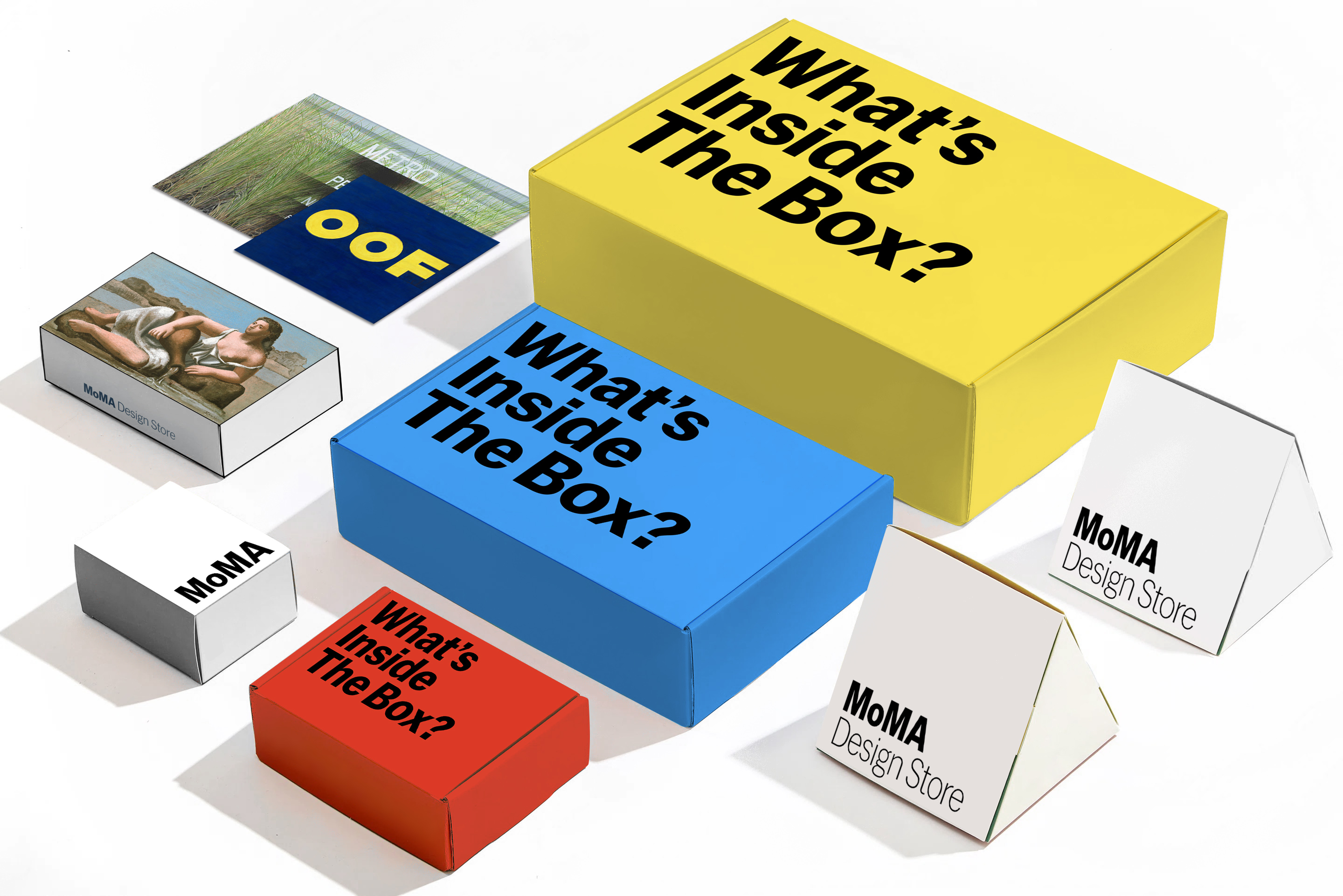
This project was to design a Fall campaign for MoMA. MoMA is the most thought-provoking museum. In this campaign, ‘the box’ is not a limitation. It’s a blank, empty box that you can fill up with whatever you like and imagine whatever you want.


DAMAGED GOODS Editorial, Naming


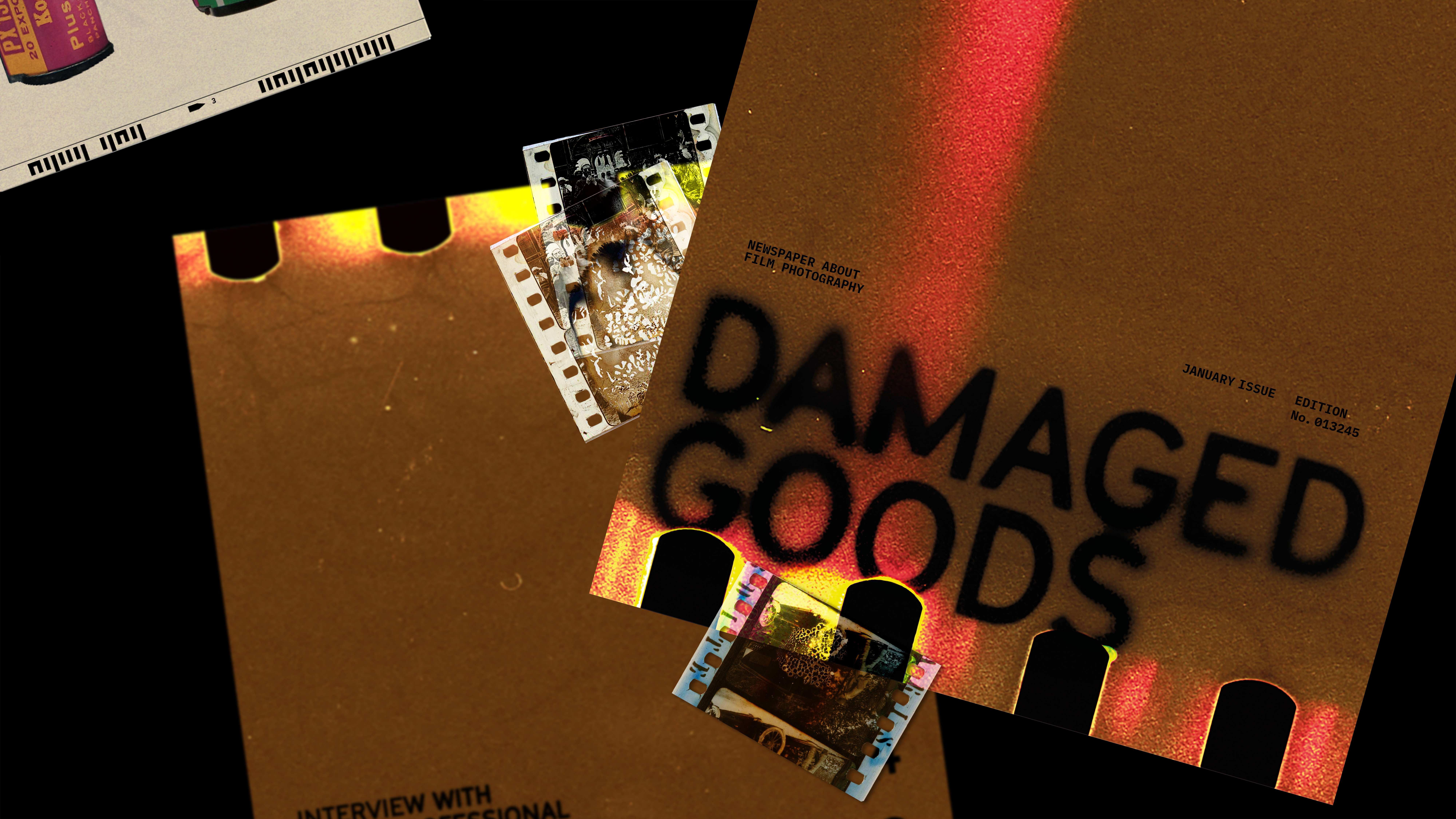
Damaged Goods is a contemporary newspaper about film photography. Damaged goods mean products that are broken, cracked, scratched, and no longer desirable. But in this newspaper, it’s quite the opposite. In film photography, damaged and ruined film and its unexpected moments are aesthetic as they are. Every page in the newspaper is somehow damaged however visually pleasing.


DAMIEN HIRST EXHIBITION  Brand Identity, Typography


The goal of this project was to design a brand identity for Damien Hirst’s special exhibition held by MoMA. The custom typeface is inspired by the frames that Damien used in his most well-known series, 'Natural History.' Based on the display type, the branding system of the exhibition is to stretch the typeface (rectangular frame) vertically so that it could convey the feeling of a cage or even a jail that locked up animals and living creatures.


MOTION ARCHIVE Motion Design


Printed Matter  Editorial


©2024 DOYEONKIM